Hannah Feehan
cv →
← all work
case study 02 · 2026

A portal for my own studio, built around one question: what do I need to see, at what point.

role
Product, design, full-stack
tools
Next.js, TypeScript, Supabase, Vercel, Claude Code
duration
4 weeks
sector
Internal tools
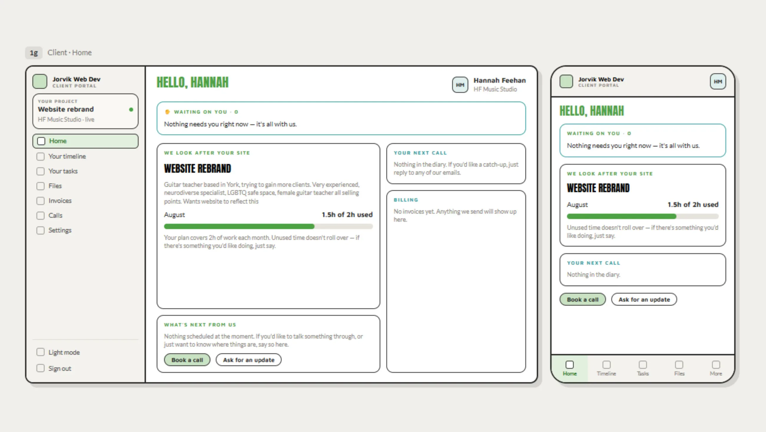
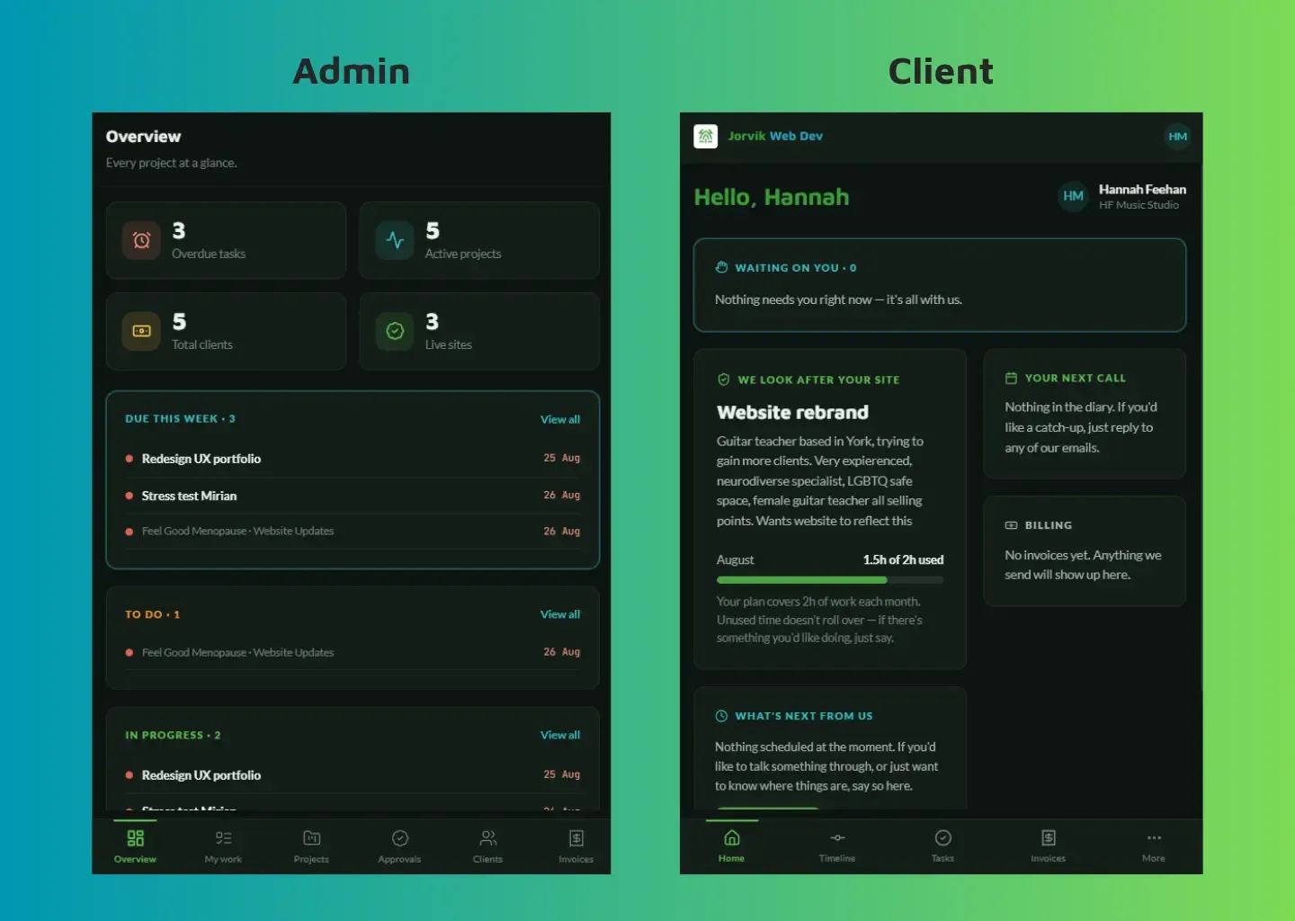
The JWD Client Portal dashboard, showing project status and milestones.
01 · problem

Projects were managed across email, Notion and ClickUp, costing money and needing a lot of set up

As a freelancer web developer and a person with AuDHD, I found going across multiple platforms for client projects frustrating and difficult to maintain consistency; taking a lot of time to set up and organise, and sometimes even training clients. Emails would get lost in the spam, clients would miss deadlines, projects would drag on due to miscommunication.

02 · research

Lived experience and past research informed every design and IA decision

There was no formal research phase during the design stage itself, because years of lived experience and education around ND behaviour (specifically how visual reminders and dopamine work for an AuDHD brain, and separately how demand framing affects PDA) had already done that work.

Layered onto the day-to-day of running JWD, that gave a working theory of what the interface actually needed to do before a single screen was designed. Designing with my AuDHD rather than against it meant building the information architecture around moments of need, not around database objects.

03 · decisions

Exactly what needs to be seen, and nothing else

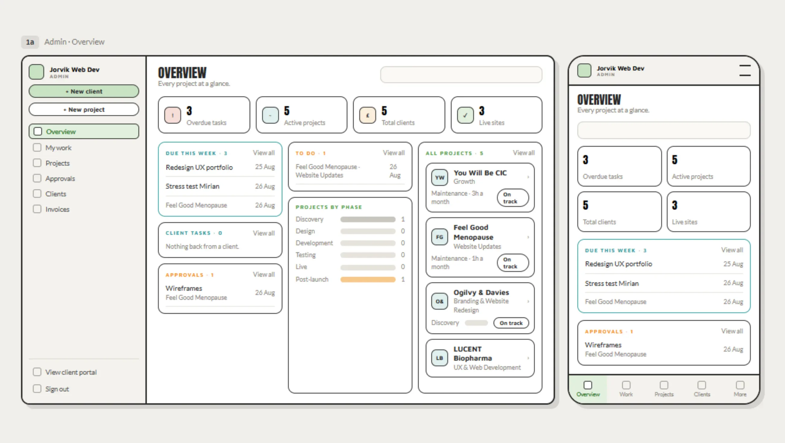
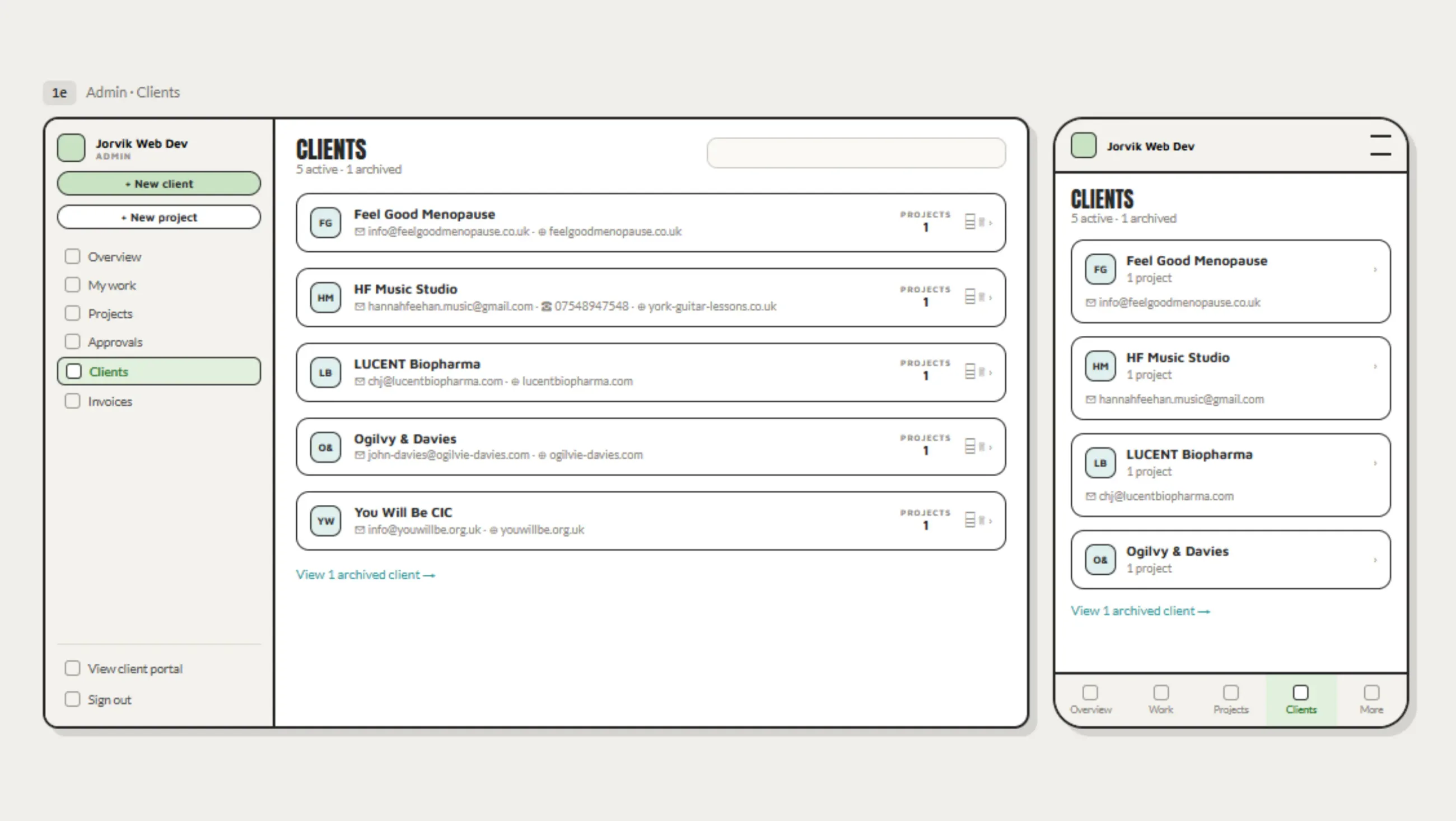
The Overview view shows specific and meaningful information.

  1. 01

    Stats sit at the top of the overview on the dashboard. Seeing how much is actually on builds momentum rather than dread by providing quick wins on low dopamine days. Utilising a colour code system and large icons frame this important information in a purposeful way that doesn't set off PDA (pathological demand avoidance), and provides quick wins for those low dopamine days.

  2. 02

    "To do" and "due this week" are separate, not one sorted list. "To do" holds everything, spanning weeks, in date order, but a long ordered list doesn't grab attention on its own. "Due this week" is the same data filtered down to what actually needs doing today, so time gets planned around what's real rather than what's merely logged.

  3. 03

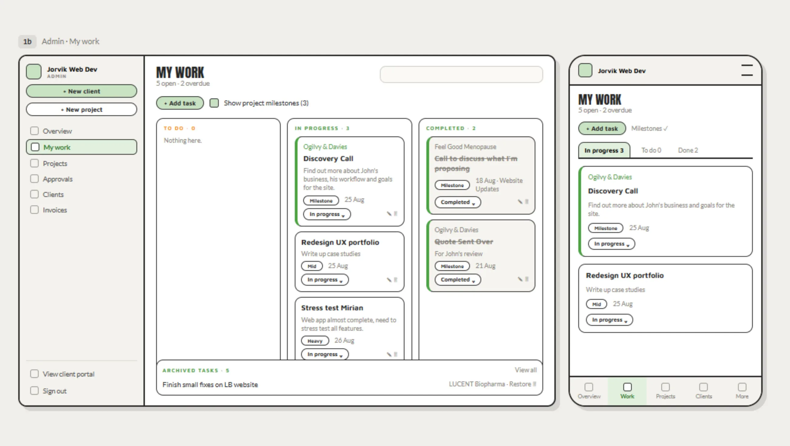
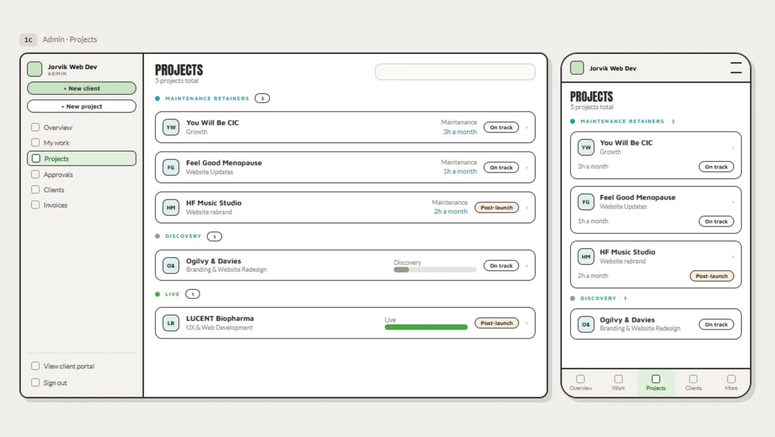
    Views are mixed, not fixed. Kanban, lists, and charts sit alongside each other so the same project can be read the way my brain needs it read that day, rather than forcing one view to do every job.

  4. 04

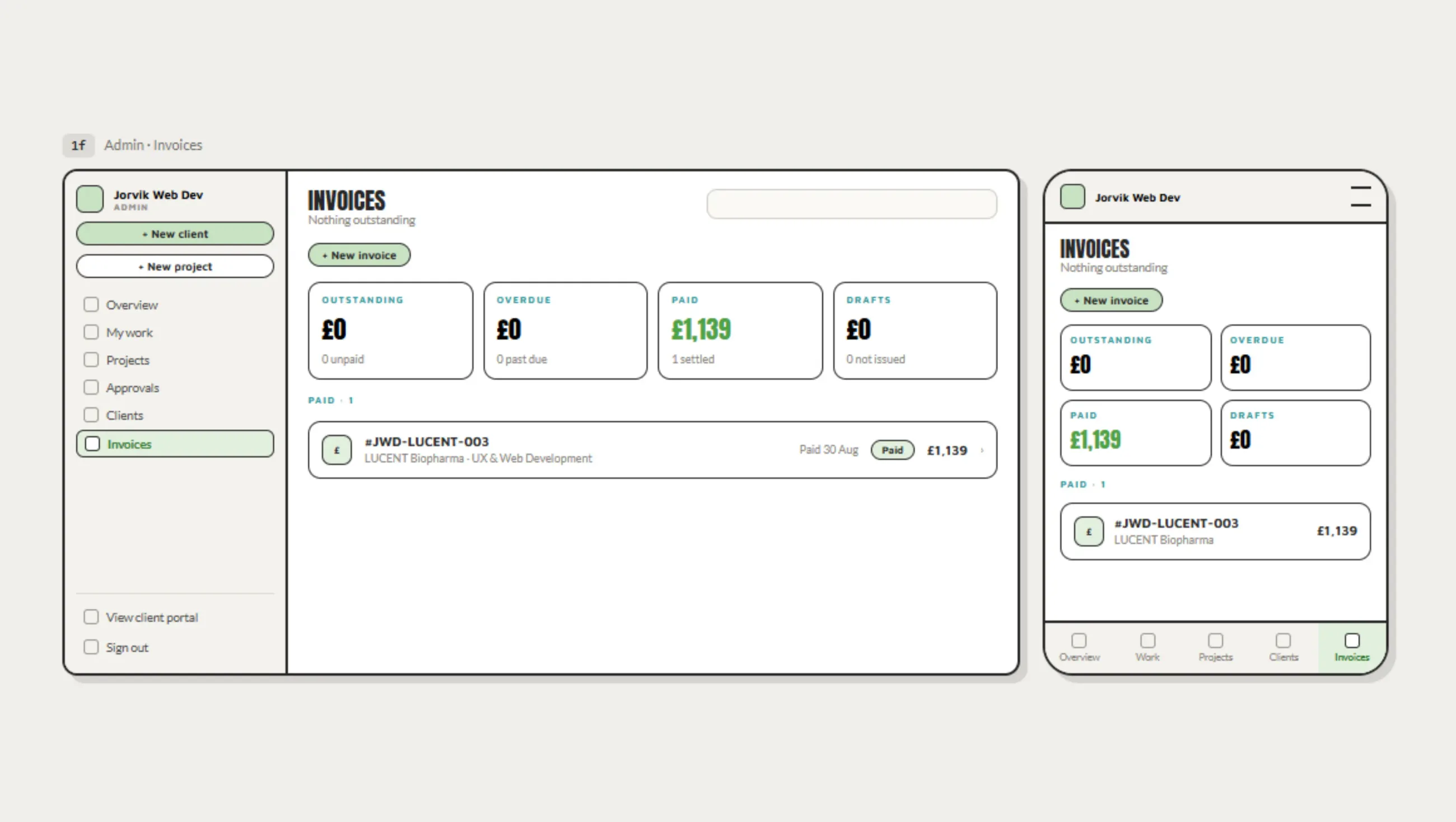
    Invoices generate with JWD branding built in, no separate tool required.

04 · handoff

Built to be handed to a client, not just used by me.

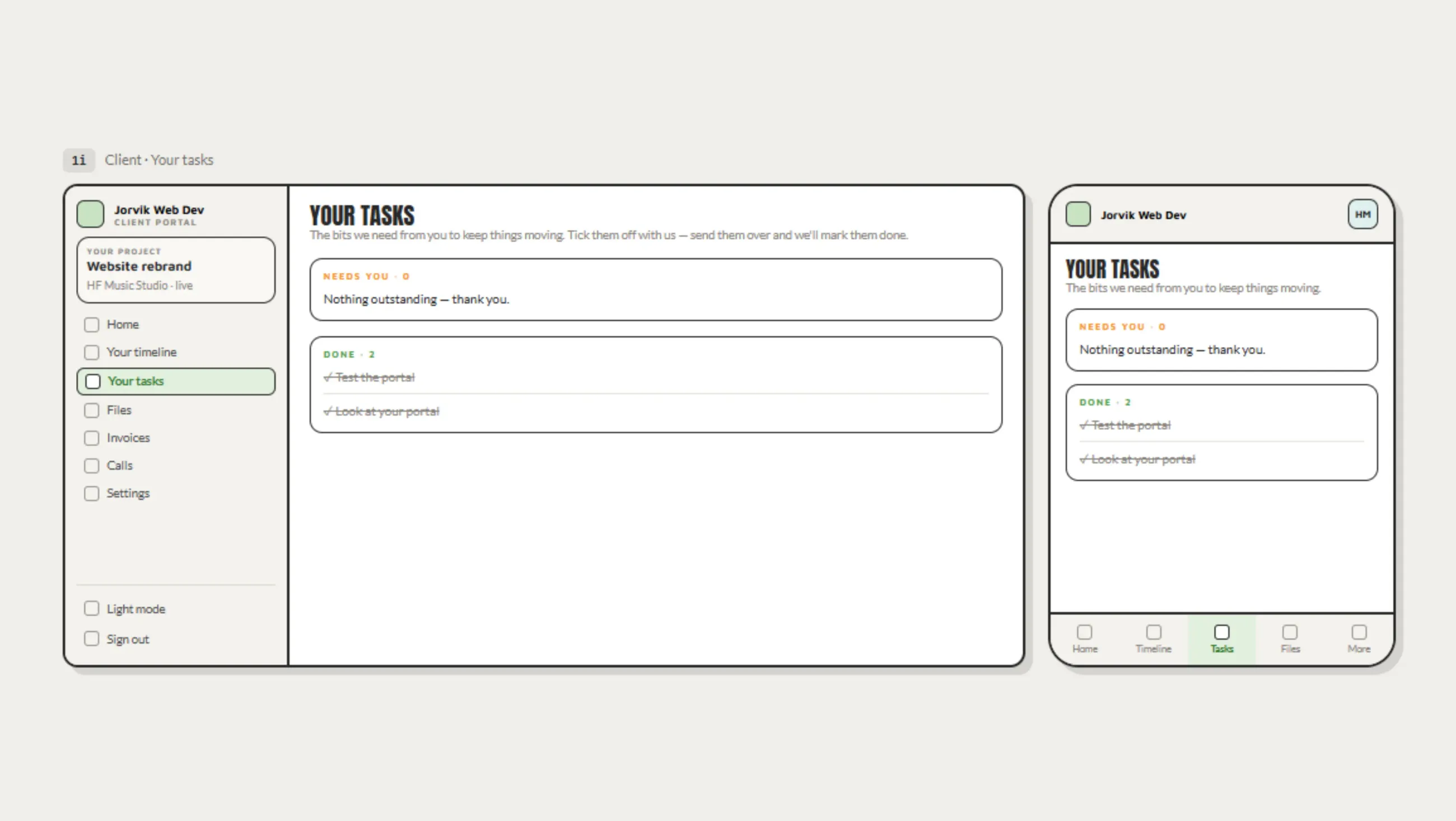
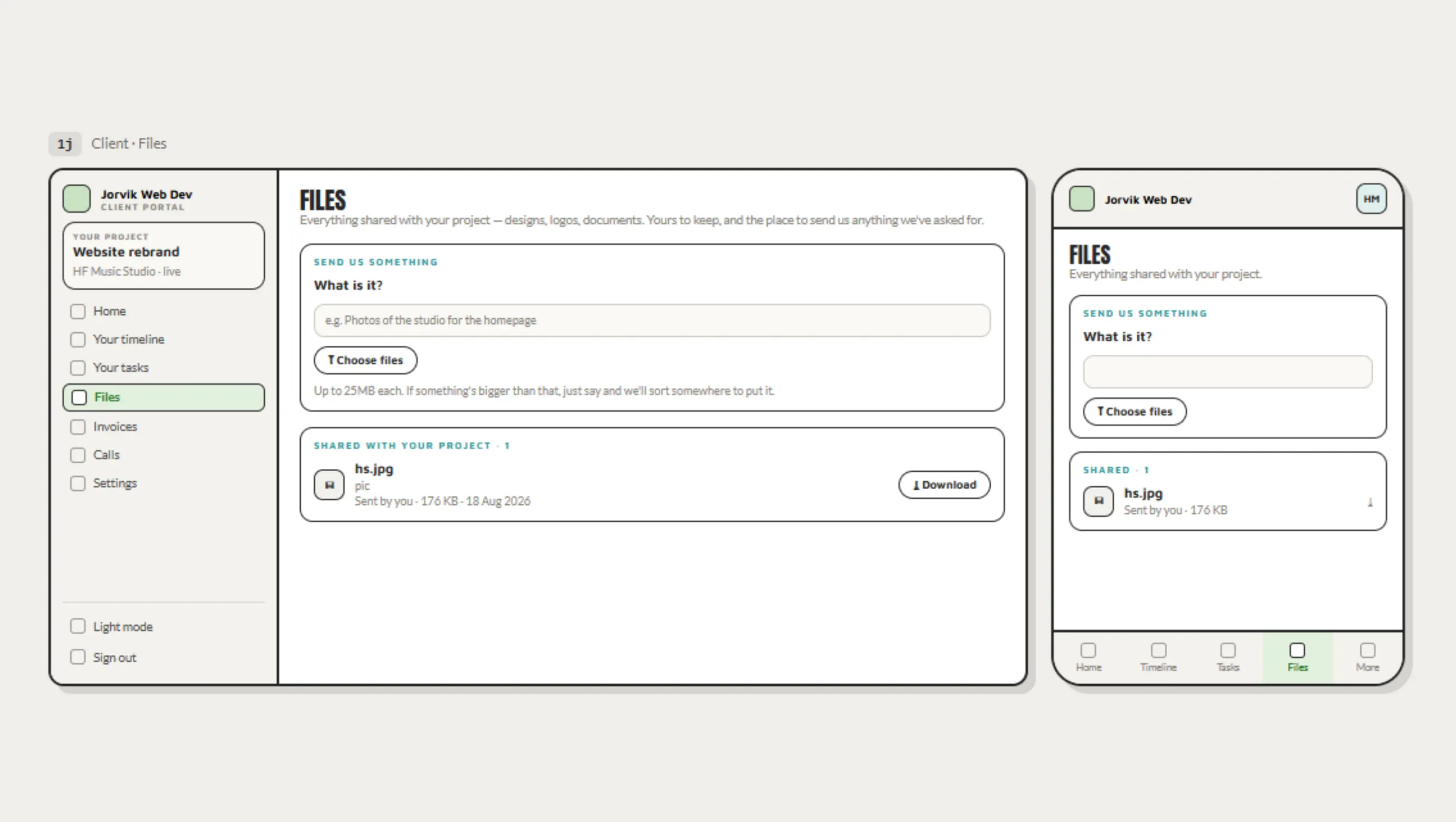
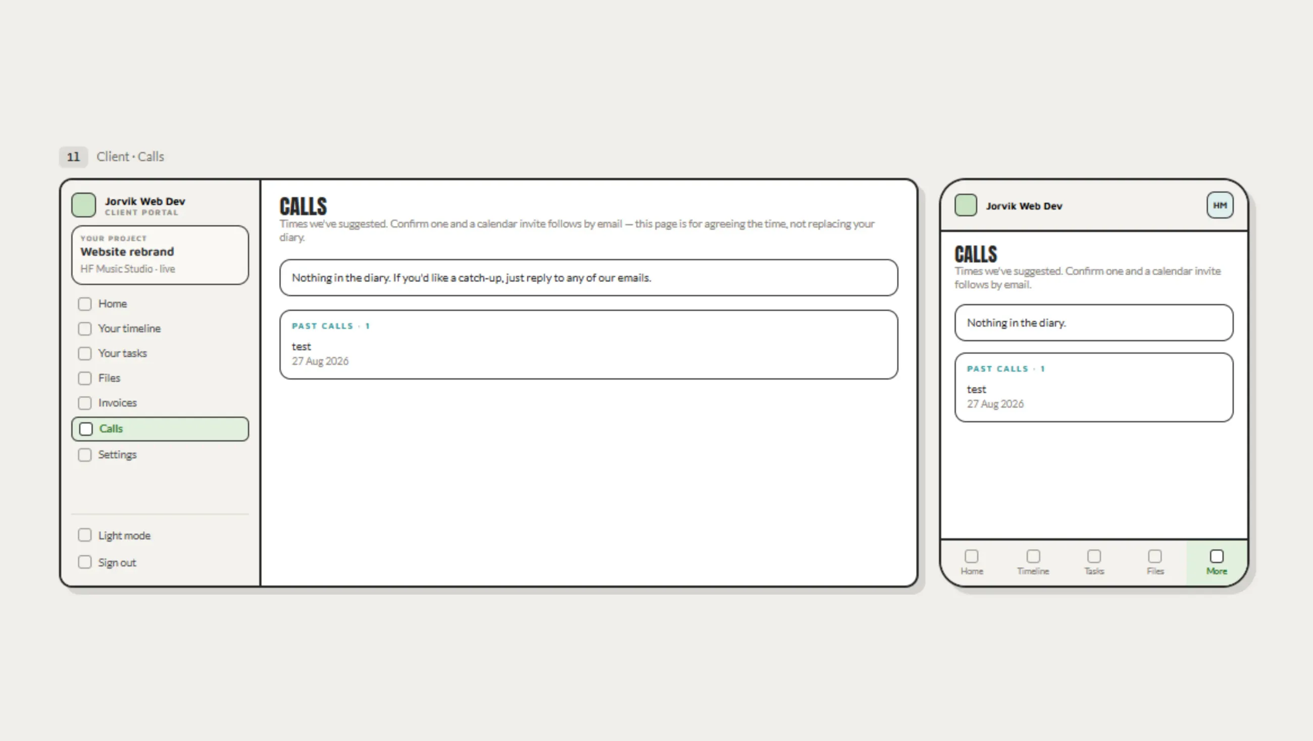
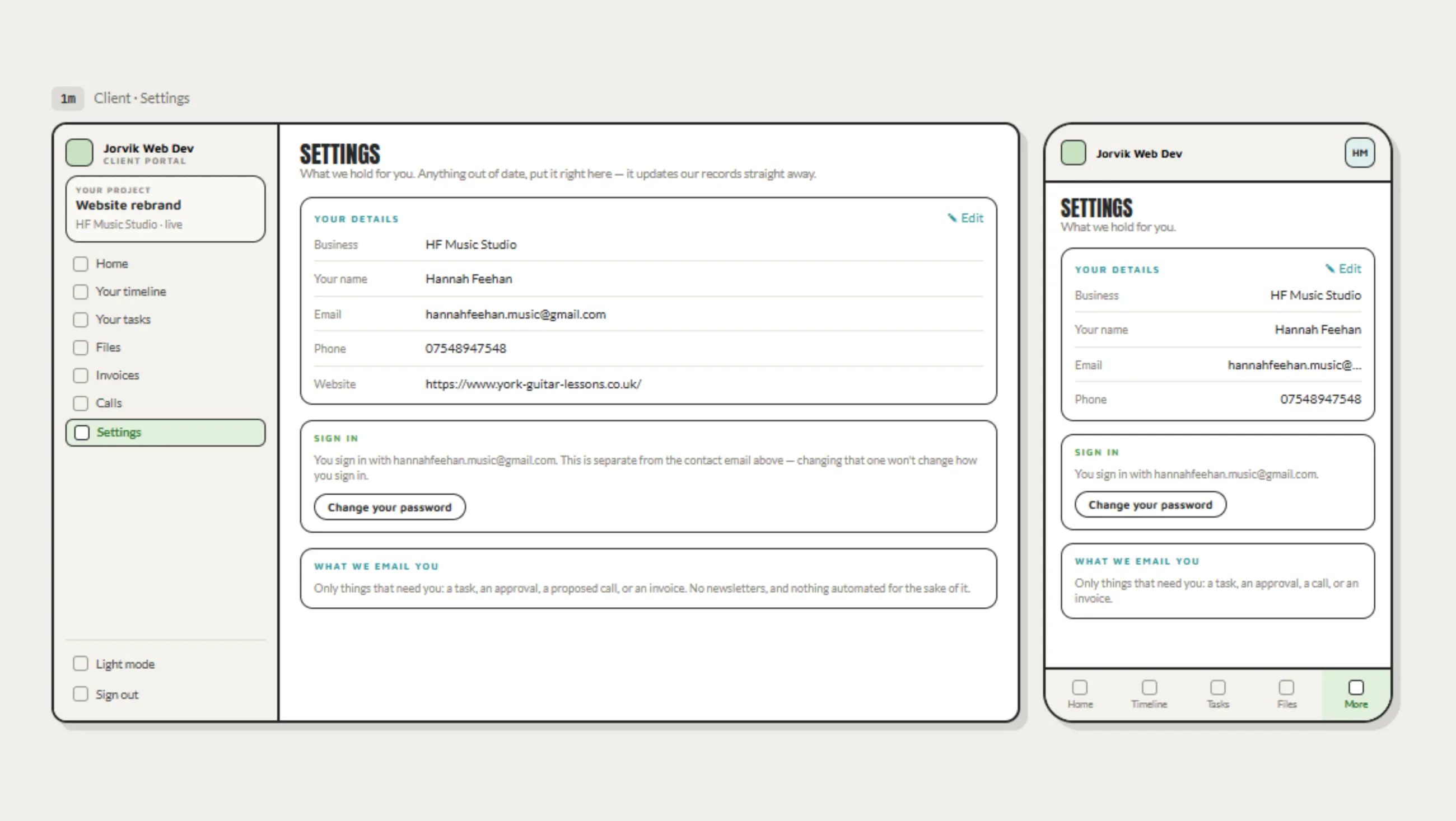
Clients are invited manually, project by project, there's no self-serve signup. Once in, access is role-based: a client sees their own project in full, but anything not relevant to them is hidden by default rather than exposed and roped off. When a project ends, its data is archived rather than deleted immediately, and cleared after two years.

05 · outcome

8 live client projects, one system instead of four, and roughly 5 to 10 hours a week back.

8
live projects
4 → 1
tools consolidated
5-10
hours saved weekly (est.)

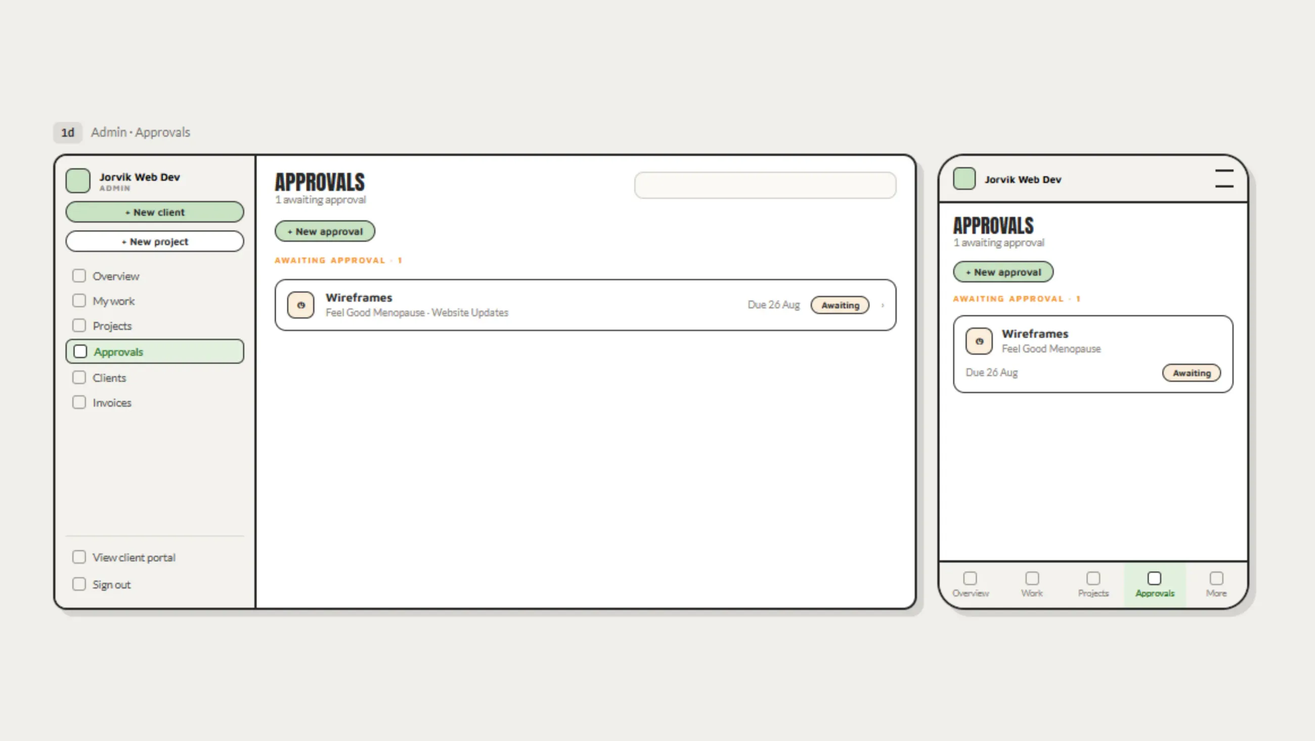
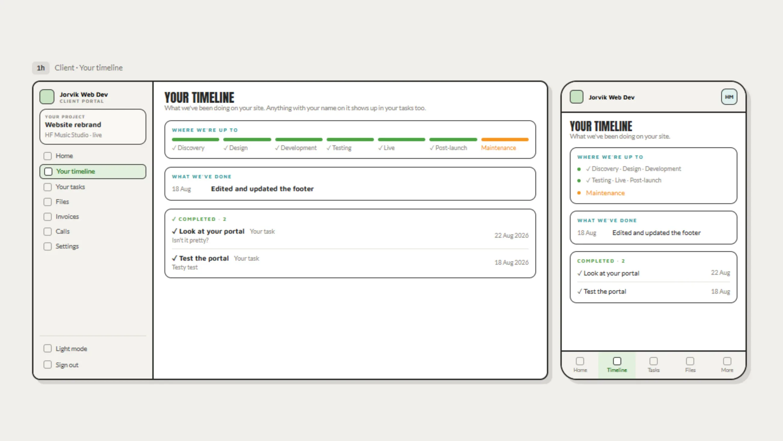
Communication with clients is clearer and lives in one place rather than scattered across email and separate tools, so they're not learning anything new to use it. Reminders and project timelines run automatically instead of me tracking them by memory, which keeps projects on track without extra admin. It's in daily use across 8 live client projects, with onboarding now a single guided path instead of a checklist held in my head.

Visit portal.jorvikweb.dev

next

Mirian